Run a test on desktop and mobile (responsive design)
https://docs.convertize.io/fr/docs/effecuter-un-test-sur-ordinateur-tablette-et-telephone-mobile-responsive-design/What is a responsive design?
Responsive design means that it allows your site to adapt to different types of device and screen sizes to provide the best user experience possible without breaking the design of your website.
Is Convertize compatible with responsive design ?
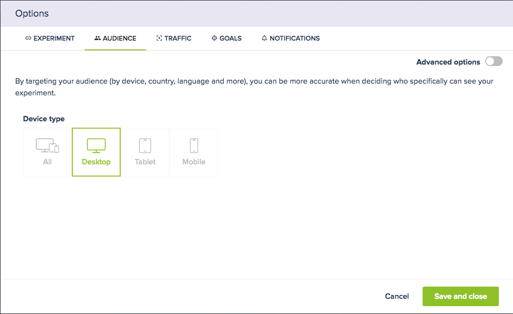
Yes, Convertize is compatible with websites using responsive design. You can select the device you want your experiment to show on in the ‘Audience’ tab of the ‘Options’ box. When ‘All’ is selected, all changes made will be applied to desktop, mobile, and tablet versions of your website.
To only target your changes at one device-type, select that type instead. In the example below, only Desktop visitors will see the experiment you set up.

Keep in mind that it is always best to check if the changes you made in the Editor Room are well implemented on the other versions. To do this, make sure ‘All’ devices are selected in options and a ‘View’ option will appear in the bottom left of the Editor Room. This allows you to switch between Desktop, Tablet, and Mobile views.
If you notice that the changes are not responsive on the different device versions, you can set different experiments for one device only. Running experiments on one device only provides some benefits:
- The user experience is not the same on different types of device. Not all the changes can be applied to desktop, mobile, and tablet versions.
- The format will not be broken when using another type of device.
- It allows you to distinguish the results by types of device.